We're officially a Great Place To Work® certified company, India | 2026–27
Mayank Patel
Sep 30, 2025
5 min read
Last updated Sep 30, 2025

For decades, B2B negotiations relied on human interaction—calls, meetings, and countless email exchanges where sellers and buyers bargained over pricing, discounts, and terms. But it also introduced delays, inefficiencies, and inconsistencies that often frustrated both sides.
In this article, we’ll explore how AI-powered tools are reshaping B2B commerce, giving companies the ability to negotiate smarter, respond quicker, and win more deals without losing the human element buyers still value.
Striking a deal has long involved haggling over prices, volumes, and terms through calls, emails, or meetings. This traditional negotiation is often a lengthy back-and-forth process. Artificial intelligence (AI) is changing all that.
AI-powered tools are essentially redefining the art of negotiation by using data and predictive analytics to mimic and improve the bargaining process. Instead of guesswork and gut feel, AI can forecast negotiation outcomes and optimize the approach.
A CPQ platform allows sales teams (or even customers via self-service) to rapidly configure a product/service, get pricing, and generate a formal quote. Think of it as your most experienced sales rep who can instantly calculate a deal in their head.
Traditionally, negotiating a complex B2B sale might require multiple quote revisions: add a product here, adjust a discount there, check with finance for approval, etc. With an AI-powered CPQ, much of this happens in seconds.
The system automatically applies all your pricing rules, volume discounts, and negotiated contract prices for that customer, just like a human rep remembering past deals. It then spits out an accurate quote document without manual errors.
AI further supercharges CPQ by making the quotes smarter and more tailored. For instance, AI algorithms in a CPQ can analyze vast past quotes, won/lost deals, customer buying habits to predict what price or off er will likely close the deal.
The CPQ might proactively suggest, “This buyer usually pushes for a 10% discount,” or “Off er product XYZ as a bundle, since similar clients found it valuable.” Salespeople using AI-driven CPQ thus simulate the negotiation internally: the system guides them on the best quote to off er right away.
Moreover, CPQ systems make sure nothing falls through the cracks; no item is mispriced or forgotten; so the buyer sees a professional, error-free proposal on the first go. Sales reps, for their part, spend less time number-crunching and more time building the relationship.
Also Read: The Hidden Cost of Delayed Digital Adoption: It’s Not Just Sales, It’s Margins
Larger purchases often go through a formal RFP/RFQ process (Request for Proposal or Quote), where the buyer invites multiple vendors to submit detailed offers. Everyone tries to put their best foot forward, sometimes after rounds of Q&A and clarifications (a form of negotiation).
With automated RFP response software, what used to take weeks of emailing and editing can now happen in a single afternoon. These tools use AI to read the requirements, pull in the relevant information from a knowledge base, and even draft tailored proposals or answers.
The system might suggest the most persuasive responses (based on what’s “worked” in past winning bids) and calculate pricing and timelines, all automatically. The benefit is that you can respond to a customer’s request in minutes instead of months.
If the buyer’s RFP questions include “Can you also include maintenance for 2 years in the quote?” an AI can recognize this and adjust the proposal or pricing instantly, much like a salesperson would quickly recalculate and say, “Sure, I can add that in, and the total will be….”
Moreover, modern B2B e-commerce platforms integrate RFQ/RFP workflows where a buyer can request a quote online, and the system will notify the seller, who can then adjust and respond through the platform in real time.
All these AI-driven systems share a common goal: making B2B commerce easier, faster, and more cost-effective by preserving the personal touch of bargaining while removing its inefficiencies. The benefits to a B2B business person are significant:
Traditionally, only your top clients might get white-glove treatment and deeply personalized deals (because it’s time-consuming to tailor proposals for everyone). AI changes that by using customer data to personalize every offer.
The pricing engine might off er a special rebate to a long-term client automatically, or the CPQ might suggest product add-ons that fi t the customer’s industry. This simulated personal touch makes the buyer feel catered to.
And it happens even for smaller clients without heavy sales intervention. AI enables this by scaling up the personal, relationship-driven aspect of bargaining to hundreds or thousands of customers at once.
Your sales team can handle more accounts because mundane quote generation and admin tasks are offloaded to AI. You might not need as many prolonged meetings or rounds of approval when the system optimizes a deal within preset guardrails.
Moreover, by negotiating smarter (using data to avoid giving away margin unnecessarily), you protect your profitability. AI-driven pricing has been shown to both improve margins and prevent revenue leakage by identifying where you’re underpricing or over-discounting.
And don’t overlook the reduction in intangibles: less friction and frustration. When the process is smooth, your salespeople are happier (they can focus on selling, not paperwork), and your customers are happier (buying becomes easy).
Paradoxically, automating negotiation can give businesses more control over the process. You can set up rules in the software—minimum margins, allowed discounts, standard terms—so that even as the AI/CPQ negotiates on the fly, it never violates your policies.
Every quote can require a quick automated check against profit thresholds or contract standards. This way, you standardize your bargaining process across the organization. Small customers get the same fair treatment as big ones; new sales reps off er deals just as wisely as veteran reps because they’re guided by the system’s recommendations.
Meanwhile, managers gain clearer visibility into what’s being offered to whom. This transparency means you can continuously refi ne your strategies, for instance, seeing that a X product is often discounted too heavily, you can readjust your pricing algorithm.
Also Read: How Modern B2B Marketplaces Drive Sales Without Adding Complexity
Say you’re a wholesale distributor in the electronics sector.
A retailer approaches you wanting to buy 1,000 units of a product and expects a good deal (a classic scenario where traditionally you’d negotiate the unit price).
Here’s how modern systems handle it:
The buyer logs into your B2B portal and triggers a “Request for Quote.” Your AI pricing engine instantly analyzes the request: it notes the high quantity, checks current stock and competitor pricing, and perhaps recognizes this buyer’s past orders.
The engine calculates that offering a 10% volume discount would likely secure the sale and still keep your margin safe. Simultaneously, your CPQ system pulls up the configured product, applies that 10% discount automatically (along with any pre-agreed terms for this buyer, like free shipping on large orders), and generates a polished quote PDF within minutes.
The buyer, sitting on the other end, sees a notification within the same portal or via email: “Your quote is ready: 1,000 units for $X, delivery in 7 days.” Perhaps the buyer was also sourcing prices from two other suppliers. But while they’re still waiting on those other quotes (or sifting through a generic PDF from a competitor), your system has already responded quickly and with a personalized offer.
The buyer can even chat back through the portal, “Can you make it 12% off ?,” essentially negotiating. Your system alerts your sales rep, who sees the request along with AI-powered guidance: “Customer asking 12% off , this would cut into minimum margin. Counter with 11%, the system shows likelihood of closing at 90%.”
The rep adjusts the quote in one click to 11% off ; the CPQ regenerates it and logs manager approval automatically since it’s within an acceptable range. Within maybe an hour of the initial inquiry, the buyer has an updated off er at 11% off , and they accept with a click. Deal done.
The team at LinearCommerce specializes in building custom B2B commerce systems that embed these AI-driven negotiation capabilities right into your sales process: the ability to handle negotiated pricing, volume discounts, custom catalogs for different buyers, special payment terms, and more.
For example,
Our aim is to tailor the platform so that it feels like a natural extension of your existing business practice, except more streamlined and data-driven.
By partnering with a team like ours, a traditional retailer or distributor can go online “the right way,” preserving the personal, flexible bargaining their customers expect, but delivering it through modern technologies.

Why Enterprise CMS Migrations Fail Before They Begin
According to the 2025 CloudBees DevOps Migration Index, 77% of enterprise migration projects exceeded budget by more than 10%. Only one in four organisations said their migration delivered expected value within a year.
Those numbers are not an argument against migration. They are an argument for approaching it differently.
The move toward enterprise headless CMS architecture is accelerating. Forrester's Q1 2025 Wave found enterprise buyers now split roughly evenly between headless and template-based delivery. The market is not debating whether to move. It is debating how to move without the 77% outcome.
This piece addresses that question directly.
The trigger is rarely a single failure. It is accumulated operational debt.
Marketing teams raise tickets to change a headline. Engineering backlogs fill with content requests that have nothing to do with engineering. A mobile application launches and someone discovers the CMS cannot feed it. A regional team needs its own content environment and the only answer is a separate installation with separate governance and separate costs.
At some point the cost of staying on the legacy platform exceeds the cost and disruption of leaving it. That is the inflection point, and increasingly organisations are reaching it faster than they expected. The gap between what traditional enterprise CMS platforms were designed for and what modern digital operations require has widened every year.
The structural problem is this: legacy systems couple content creation, presentation logic, and delivery into a single layer. Every new channel, every new market, every new front-end framework becomes a negotiation with that coupling. The organisation adapts to the platform instead of the platform serving the organisation.
Enterprise headless CMS decouples the content management layer from the delivery layer. The CMS stores, structures, and governs content. The front end, whether a website built in Next.js, a mobile application, a retail kiosk, or an AI assistant, retrieves that content via API and renders it in context.
The operational implication is significant. A single piece of content can be authored once and delivered simultaneously across every channel without duplication, without version drift, and without a separate team managing each touchpoint.
The tension that pure headless CMS introduced was editorial experience. Developers gained API flexibility. Marketing teams lost the ability to see what they were creating in context. Every preview required a developer. Every layout change required engineering input.
Visual headless CMS resolves this tension. It preserves the structured, API-first content model while returning a live editing interface to content teams. Editors see how the page renders before publishing. Developers retain the architectural freedom they need. This is the balance most compliance-led enterprises actually need to operate at scale, and it is the architecture that platforms like dotCMS are built around.
Also Read: Enterprise Headless CMS: What to Assess Before You Shortlist a Platform
Migration projects that struggle almost always share one characteristic: they are treated as technical projects rather than organisational ones. Platform selection matters. Implementation approach matters more. Organisational readiness determines both.
There are four points where migrations consistently break down.
Content architecture underestimated
Legacy CMS platforms store content as pages, a URL, a template, a body of HTML. Headless CMS stores content as structured objects: discrete fields, typed attributes, defined relationships. Before a single piece of content moves, it needs to be remodelled.
Most organisations discover that 30 to 40% of their existing content is redundant, outdated, or structurally inconsistent during a comprehensive audit. A site with several hundred pages often contains thousands of content fragments when examined properly. Building this rationalisation into the project plan is not pessimism. It is accuracy.
Governance undefined before go-live
In legacy CMS environments, governance is often informal, a set of conventions that evolved over years rather than a designed system. A structured enterprise headless CMS platform forces this to be explicit. Workflows, approval chains, user roles, and publishing permissions need to be architected before launch, not discovered after it.
For compliance-led enterprises in financial services, healthcare, or regulated manufacturing, this is not a configuration task. It is a content operations design exercise. Treating it as anything less is the fastest route to a post-launch governance failure.
Integration dependencies mapped late
Legacy enterprise CMS platforms accumulate integrations over time: analytics, personalisation, search, CRM, digital asset management, e-commerce. Each integration needs to be assessed against the new API-first architecture. Some connect cleanly. Some need to be rebuilt. Some need to be replaced.
Mapping these dependencies at the start of the project, not during development, prevents the scope expansion that derails timelines and inflates budgets.
Team readiness treated as an afterthought
The migration is not complete when the platform is live. It is complete when the teams using it can operate independently and confidently. Training, documentation, and a supported transition period are not optional extras in an enterprise context. They are delivery components.
Enterprise headless CMS adoption fails most visibly at this point, not because the platform is wrong but because the organisation was not prepared to use it.
Also Read: Headless vs Hybrid vs “Universal” CMS: Which Model Fits Multi-Team Delivery?
The organisations that manage CMS migrations most effectively treat them as structured transitions rather than cut-overs.
Phase the migration, do not cut over. Running the legacy platform and the new platform in parallel for a defined period, starting with lower-risk content areas and migrating progressively, reduces delivery risk and gives teams time to develop operational competency before the full switch.
Define the content model before selecting the front end. The content architecture decision shapes editorial workflows for years. Front-end framework choices are reversible in a headless architecture. Content model decisions are significantly less so.
Invest in the front-end layer. A decoupled architecture requires a capable front end. If the organisation's engineering team is not experienced with the frameworks commonly used in headless implementations, that capability either needs to be built or sourced from an implementation partner with direct experience in enterprise headless CMS delivery.
Validate governance in staging. Approval workflows, role-based permissions, and audit logging need to be tested against realistic editorial scenarios before go-live, not after the compliance team reviews the first published page.
The case for moving to an enterprise headless CMS is not made in the platform. It is made in what the platform unlocks.
Marketing teams that no longer wait on engineering publish faster, localise faster, and test faster. Engineering teams freed from content maintenance focus on product development. Governance teams operating within a structured, auditable workflow environment have cleaner records and fewer compliance incidents.
Organisations running multi-site management from a single governed environment, rather than maintaining separate CMS installations for each brand, region, or microsite, begin to see content infrastructure as a commercial asset rather than a maintenance cost.
Prominent businesses that have moved to headless architecture report 65% faster time to market for new digital channels and touchpoints. The gap between organisations that have made this shift and those still managing monolithic enterprise CMS platforms will widen as omnichannel delivery, AI content integration, and multi-region operations become baseline expectations rather than competitive advantages.
The choice of implementation partner shapes the migration outcome as much as the choice of enterprise CMS platform.
A capable partner brings three things beyond technical execution: a methodology for content architecture grounded in how the organisation actually operates, experience navigating the governance and integration questions that arise in enterprise environments, and the ability to work across the boundary between marketing and engineering without losing either team in the process.
Platform expertise is necessary. Understanding what the platform is being asked to do, and for whom, is what separates a successful enterprise headless CMS migration from one that joins the 77%.
Linearloop is a dotCMS implementation partner specialising in AI-led product engineering and digital transformation. If your organisation is evaluating a CMS migration or modernising existing content infrastructure, reach out to begin the conversation.
Mayank Patel
Jul 10, 20265 min read

Enterprise Headless CMS: What to Assess Before You Shortlist a Platform
An enterprise headless CMS separates content storage from the front end that displays it, delivering content through an API so the same content can power a website, a mobile app, or any other channel independently. Choosing the right one depends on three things: how many channels your content actually needs to reach; how much front-end engineering capacity your team can commit long-term; and how complex your governance requirements are across regions or business units.
Most vendor conversations start with a feature list. That is the wrong entry point, because features do not tell you whether your organisation can actually sustain the platform once it is live. This guide covers the evaluation framework we walk enterprise teams through before any shortlist gets built, the structural comparison between platform models, and the decision logic that follows from it.
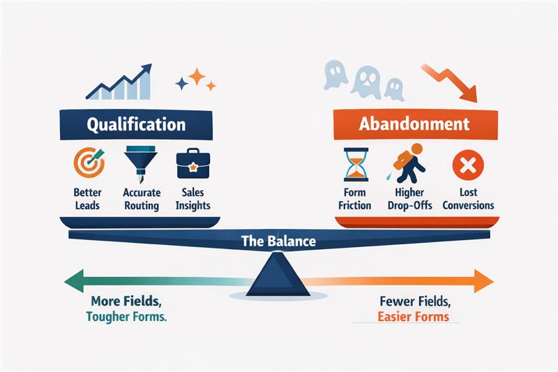
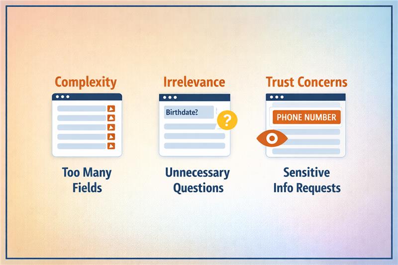
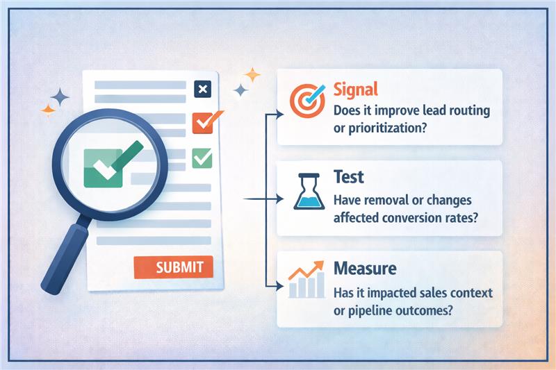
Also Read: Why Some Lead Form Fields Kill Conversions (And Which Ones Actually Help)
An enterprise CMS is a content management system built to handle the volume, governance, security and integration complexity that a single site or small business CMS is not designed for. Multiple brands, regions, approval chains and content types are the norm, not the exception. Whether that enterprise CMS should be headless, hybrid or traditional is a separate decision, and it is the one this guide answers.
Headless CMS means separating content storage from the front end that displays it, so the same content reaches a website, an app or any other channel through an API instead of a built-in template. A traditional CMS renders the page itself. A headless CMS hands content to whatever system asks for it, and that system decides how to display it.
A hybrid CMS, where platforms like dotCMS sit, keeps that API-first content layer but adds an optional front end and visual editing tools on top so marketing teams are not left waiting on engineering for every page change.
The distinction changes who owns the decision. A traditional CMS choice is largely a marketing and content operations call. A headless CMS choice is an architecture decision with marketing consequences, and it needs both functions in the room from day one.
Also Read: B2B Marketplace Logistics Workflow (End-to-End Workflow)
If the honest answer is one website, the case for headless is weaker than any headless platform's sales page will admit. Headless earns its complexity when content genuinely needs to reach multiple surfaces.
Enterprise content rarely takes one shape. A product page, a regulatory disclosure and a campaign landing page each need different fields, relationships and governance. Evaluate a platform's content modelling against your actual content types, not the demo's blog post example.
Response times, caching behaviour and rate limits under real traffic are where headless platforms diverge most from their marketing claims. Ask for load tested numbers on content structures similar to yours, not published benchmarks on a blank content model.
This is the most common regret in headless migrations. Pure API-first platforms can leave marketing teams dependent on engineering for changes that used to take five minutes. A hybrid layer or a well-built preview and editing experience is not a nice to have at enterprise scale. It is the difference between adoption and a shelved project.
Role-based permissions, approval workflows and localisation need to be assessed against your actual organisational structure, including the parts of it that are politically inconvenient to model. A platform that assumes one content team, one brand and one approval chain will not survive contact with a matrixed enterprise.
Content rarely lives alone. If product data, digital asset management or personalisation engines are already in place, the CMS has to integrate cleanly with them, not force a rebuild of adjacent systems that already work.
Vendor lock-in in headless CMS is quieter than in traditional platforms. It shows up in proprietary query languages, custom field types with no export path, and content models that only make sense inside one vendor's schema. Ask this before signing, not during the exit.
Implementation, custom front-end development, ongoing engineering support and migration efforts usually outweigh licensing costs over three years. A cheaper licence with a heavier build is not automatically the cheaper decision. Model the fully loaded cost across a three-year horizon before comparing quotes.
Also Read: Building a B2B Marketplace: Complete Blueprint for Scale, Trust, and Liquidity
The category splits into three architectural models, not a single spectrum of "more or less headless". Understanding which model a platform belongs to tells you more than any feature checklist.
Model | Representative Platforms | Strongest For | Weakest For |
Traditional monolithic | Adobe Experience Manager (legacy mode), WordPress (default) | Single-channel sites needing fast launch and minimal engineering overhead | Multi-channel delivery, API-first integrations, scaling past one front end |
Pure headless | Contentful, Sanity | Maximum channel flexibility, engineering-led teams building custom front ends | Editorial independence, out-of-the-box governance, teams without dedicated front-end resources |
Hybrid | dotCMS, Storyblok | Balancing API-first architecture with a working front end and visual editing | Teams needing extreme customisation beyond what the hybrid layer exposes |
The comparison that matters is not which platform has more features. It is which architectural model matches your organisation's actual engineering capacity and channel ambition. A pure headless platform in the hands of a marketing-led team with no dedicated front-end engineers will underperform a hybrid platform on time to value, regardless of API quality.
Within the hybrid category, dotCMS's position is specific. Content architecture is API-first from the ground up, but the platform ships with enough front-end and visual editing capability that marketing teams retain publishing independence. That trade-off is why it tends to fit enterprise teams that want headless-grade flexibility without building and maintaining a bespoke front end and editorial layer from scratch. You can see how this plays out in practice on our dotCMS partnership page.
Rather than scoring platforms feature by feature, work through this sequence.
If no, a traditional CMS is likely the correct answer, and the rest of this framework is premature. If yes, proceed.
If yes, a pure headless platform becomes viable, and API architecture and content modelling flexibility should carry the most weight in your evaluation. If no, proceed to hybrid platforms and weight editorial independence more heavily than raw API flexibility.
If governance is simple, most hybrid and headless platforms will satisfy it. If governance is complex, this becomes a disqualifying filter before cost or features are even discussed. Request a governance model walkthrough against your actual org chart before any commercial conversation.
Heavy integration load favours platforms with mature, documented APIs and existing connectors to your specific stack over platforms with broader but shallower integration claims.
Before signing, confirm content export format, whether custom field types are portable, and what a migration off the platform would realistically require. This is the question every vendor conversation skips and the one every failed migration wishes had been asked earlier.
The trade-off underneath all five steps is the same one: flexibility against build effort. A pure headless platform maximises flexibility and asks the most of your engineering team. A traditional platform minimises build effort and caps your channel ceiling. A hybrid platform trades a slice of flexibility for a working editorial layer, which is usually the correct trade for enterprise teams that need to move on content without a permanent squad dedicated to CMS infrastructure.
Also Read: How B2B Marketplaces Can Attract, Qualify, and Convert High-Value Buyers
Most enterprise buyers researching this topic are not starting from zero. They are running an existing CMS and deciding whether, and how, to move. The migration follows a predictable lifecycle, and where it breaks down is consistent across projects.
Catalogue existing content types, volume, and every system currently integrated with the CMS, including the undocumented ones. Most timelines go wrong here, because the audit is treated as a formality rather than the foundation for everything after it.
Rebuild the content architecture for the target platform before touching migration tooling. A content model copied directly from the old system replicates its constraints rather than solving them.
Migrate in stages, keeping the existing front end live wherever possible while the content layer is rebuilt underneath it. A full rebuild that goes live in one cutover carries more risk than the timeline pressure to do it that way usually accounts for.
Train content teams on the new publishing workflow before decommissioning the old system, not after. This is the stage most technical migration plans underwrite, and the one that determines whether the new platform gets adopted or quietly worked around.
A phased migration that keeps a working front end in place while the content architecture is rebuilt underneath it is, in most enterprise contexts, faster to production and materially lower risk than a full rebuild attempted in one pass.
This is the same framework we use as a dotCMS implementation partner when a client is deciding between a full headless rebuild and a phased migration that preserves a working front end while the content architecture is rebuilt underneath it. The right answer has depended less on the platform's feature list and more on how much appetite the organisation has for owning a custom front end and how urgently new channels need to ship.
The teams that get the most value from a headless or hybrid migration are the ones that work through the eight questions and the decision tree honestly before they see a single demo, because a demo will always look capable. The gap between a demo and a production system at enterprise scale is exactly where these questions live.
If your team is weighing a headless or hybrid CMS migration and the framework above raises more uncertainty than clarity, that is normal at this stage. Our team can walk through your specific content architecture and integration landscape on a call and help you work out where you actually sit on the flexibility versus build effort trade-off before you shortlist vendors.
Mayank Patel
Jul 6, 20265 min read
")