We're officially a Great Place To Work® certified company, India | 2026–27
Mayank Patel
Sep 15, 2025
5 min read
Last updated Sep 15, 2025

Every ecommerce team wants higher conversions. But too often, optimization eff orts rely on guesswork—redesigning a button here, changing copy there—without clear evidence of what actually moves the needle. This results in sporadic wins at best and wasted effort at worst.
The most effective CRO programs don’t chase random ideas; they follow a system. They start with careful observation of user behavior, enrich those signals with analytics and feedback, form structured hypotheses, and run disciplined experiments.
Heatmaps, session recordings, form analytics, and funnel data are powerful tools, but they’re only valuable when used to generate focused hypotheses you can test. This guide walks you through that end-to-end process: how to map user behavior, enrich signals, frame testable ideas, experiment without pitfalls, and scale what works.
The first step is observation. Mapping what users actually do on your site. This involves using tools to visualize and record user interactions. By capturing how visitors navigate pages, where they click, how far they scroll, and where they get stuck, you build a factual baseline of current UX performance. Key behavior-mapping tools include:
Visual overlays that show where users click, move their cursor, or spend time on a page. Hot colors indicate areas of high attention or clicks, while cool colors show low engagement. If a CTA or important link is in a “cool” zone with few clicks, it might be poorly placed or not visible enough.
A specialized heatmap showing how far down users scroll on a page. This reveals what proportion of visitors see each section of content. In practice, user attention drops sharply below the fold. If a scroll map shows that only 20% of users reach a critical product detail or signup form, that content is effectively unseen by the majority. This observation signals a potential layout or content hierarchy issue.
These capture real user sessions as videos. You can watch how visitors browse, where they hesitate, and what causes them to leave. Session replays are like a “virtual usability lab” at scale, for example, a user repeatedly clicking an image that isn’t clickable (a sign of confusion), or moving their mouse erratically before abandoning the cart (a sign of frustration).
By reviewing recordings, patterns emerge (e.g. many users rage-clicking a certain element or repeatedly hovering over an unclear icon). Establish a consistent process for reviewing replays (for instance, log “raw findings” in a spreadsheet with notes on each observed issue) so that subjective interpretation is minimized and recurring issues can be quantified.
Specialized tracking of form interactions (e.g. checkout or sign-up forms). Form analytics show where users drop off in a multi-step form, which fi elds cause errors or timeouts, and how long it takes to complete fi elds. For example, if many users abandon the “Shipping Address” step or take too long on “Credit Card Number,” those fi elds might be causing friction.
After gathering behavioral data, the next step is enriching that data. This is where we transition from what users are doing (quantitative data) to why they’re doing it (qualitative context).
Key enrichment methods include:
Quantitative analytics (from tools like Google Analytics or similar) help size the impact of observed behaviors. They answer questions like: How many users experience this issue? Where in the funnel do most users drop off ? For example, a heatmap might show a few clicks on a “Add to Cart” button but analytics can tell us that the page’s conversion rate is only 2%, and perhaps that 80% of users drop off before even seeing the button.
Analytics can also correlate behavior with outcomes: e.g. “Users who used the search bar converted 2X more often.” These metrics highlight which observed patterns are truly hurting performance. They also help prioritize a problem affecting 50% of visitors (e.g. a homepage issue) is more urgent than one affecting 5%.
Breaking down data by visitor segments (device, traffic source, new vs. returning customers, geography, etc.) enriches the signals by showing who is affected. Often, averages hide divergent behaviors. For instance, segmentation might reveal that the conversion rate on desktop is 3.2% but on mobile only 1.8%, implying mobile users face more friction (common causes: smaller screens, slower load times, less convenient input).
Or perhaps new visitors click certain homepage elements far more than returning users do. By segmenting heatmaps or funnels, patterns emerge. For example, mobile visitors might scroll less and miss content due to screen length, or international users might struggle with a location-specific element. These insights guide more targeted hypotheses (maybe the issue is primarily on mobile, so test a mobile-specific change).
Sometimes the best way to learn “why” users behaved a certain way is to ask them. Targeted surveys and feedback polls can be deployed at strategic points. For example, an exit-intent survey when a user drops out of checkout (“What prevented you from completing your purchase today?”). Or an on-page poll after a user scrolls through a product page without adding to cart (“Did you find the information you were looking for?”).
Survey responses often highlight frictions or doubts. For example, “The shipping cost was shown too late” or “I couldn’t find reviews.” These qualitative signals explain the observed behavior (e.g. “why did 60% abandon on shipping step?”). Even language from customers can be valuable; if multiple users say “the form is too long,” that’s a clear direction for hypothesis. User reviews and customer service inquiries are another VoC source.
In addition to direct user feedback, an expert UX/CRO audit can enrich signals by identifying known usability issues that might explain user behavior. For example, if session replays show users repeatedly clicking an image, a UX heuristic would note that the image isn’t clickable but looks like it should be (violating the principle of affordance). While this is more expert-driven than data-driven, it helps generate potential causes for the observed friction which can then be tested.
The result of signal enrichment is a more complete problem diagnosis. We combine the quantitative (“how many, how often, where”) with the qualitative (“why, in what way, what’s the user sentiment”) to turn raw observations into actionable insights. Quant data may tell us that users are struggling, but it doesn’t tell us what specific problems they encountered or how to fi x them, for that, qualitative insights are needed.
Likewise, qualitative anecdotes alone can be misleading if not quantified. Thus, a core LinearCommerce strategy is to triangulate data. Every hypothesis should ideally be backed by multiple evidence sources (e.x. “Analytics show a 70% drop-off on Step 2 and session recordings show confusion and survey feedback cites ‘form is too long’”). When multiple signals point to the same issue, you’ve found a high-confidence target for optimization.
Also Read: How to Engineer Cloud Cost Savings with Kubernetes
With a clear problem insight in hand, we move to forming an hypothesis. A hypothesis is a testable proposition for how changing something on the site will affect user behavior and metrics. Crafting a strong hypothesis helps you run experiments that are grounded in rationale, focused on a single change, and tied to measurable outcomes.
In the LinearCommerce framework, a good hypothesis has several key characteristics:
The hypothesis must directly address the observed problem with a cause-and-effect idea. We don’t test random ideas or “flashy” redesigns in isolation. We propose a change because of specific evidence.
For example: “Because heatmaps show the CTA is barely seen by users (only 20% scroll far enough) and many users abandon mid-page, we believe that moving the CTA higher on the page will increase click-through to the next step.” This draws a clear line from observation to proposed solution.
Defi ne exactly what you will change and where. Vague hypotheses (“improve the checkout experience”) are not actionable. Instead: “Adding a progress indicator at the top of the checkout page” or “Changing the ‘Buy Now’ button color from green to orange on the product page” are concrete changes.
Being specific is important both for designing the test and for interpreting results. Each hypothesis should generally test one primary change at a time, so that a positive or negative result can be attributed to that change. (Multivariate tests are an advanced method to test multiple changes simultaneously, but even then each factor is explicitly defined.)
A hypothesis should state the expected outcome in terms of user behavior and the metric you’ll use to measure it. In other words, what KPI will move if the hypothesis is correct? For example: “…will result in an increase in checkout completion rate” or “…will reduce form error submissions by 20%”. It’s important for you to pick a primary metric aligned with your overall goal.
If your goal is more purchases, the primary metric might be conversion rate or revenue per visitor; not just clicks or time on page, which are secondary. Defining the metric in the hypothesis keeps the team focused on what success looks like.
Pitfall to avoid: choosing a metric that doesn’t truly reflect business value (e.g. click rate on a button might go up, but if it doesn’t lead to more sales, was it a meaningful improvement?). Teams must agree on what they are optimizing for and use a metric that predicts long-term value. For instance, optimizing for short-term clicks at the expense of user frustration is not a win.
A helpful format for writing hypotheses is:
“Because we see (data/insight A), we believe that changing (element B) will result in (desired effect C), which we will measure by (metric D).”
For example: “Because 18% of users abandon at the shipping form (data), we believe that simplifying the checkout to one page (change) will increase completion rate (effect), as measured by checkout conversion% (metric).”
After writing hypotheses, prioritize them.
You’ll generate many hypothesis ideas (often added to a backlog or experimentation roadmap). Not all can be tested at once, so rank them by factors like impact (how much improvement you expect, how many users affected), confidence (how strong the evidence is), and eff ort (development and design complexity).
A popular prioritization framework is ICE: Impact, Confidence, Ease. For instance, a hypothesis addressing a major dropout point with strong supporting data and a simple UI tweak would score high (and likely be tested before a hypothesis about a minor cosmetic change) rather than falling for the HIPPO effect (Highest Paid Person’s Opinion) or pet projects without data.
With hypotheses defined, we proceed to experimentation, where we run controlled tests to validate (or refute) our hypotheses. A disciplined experimentation process is crucial: it’s how we separate ideas that actually improve conversion from those that don’t. Below are best practices for running experiments, as well as common pitfalls to avoid.
The most common approach is an A/B test; splitting traffic between Version A (control, the current experience) and Version B (variant with the change) to measure differences in user behavior. A/B tests are powerful because they isolate the effect of the change by randomizing users into groups.
For more complex scenarios, you might use A/B/n (multiple variants) or multivariate tests (testing combinations of multiple changes simultaneously), but these require larger traffic to reach significance. If traffic is limited, sequential testing (rolling out a change and comparing before/after, carefully accounting for seasonality) could be considered, though it’s less rigorous.
In any case, the experiment design should align with the hypothesis: test on the specified audience (e.g. mobile users if hypothesis was mobile-focused), run for the planned duration, and make sure you’re capturing the defined metrics (set up event tracking or goals if needed).
Perhaps the biggest testing pitfalls are statistical in nature. It’s essential to let the test run long enough to gather sufficient sample size and reach statistical significance for your primary metric. Ending a test too early, for example, stopping as soon as you see a positive uptick can lead to false positives (noise being mistaken for a real win). This is known as the “peeking” problem.
To avoid this, determine in advance the needed sample or test duration based on baseline conversion rates and the minimal detectable lift you care about. Use statistical calculators or tools that enforce significance thresholds. Remember that randomness is always at play; a standard threshold is 95% confidence to call a winner.
Before trusting the outcome, verify the experiment was implemented correctly. Check for SRM (Sample Ratio Mismatch) if you intended a 50/50 traffic split but one variant got significantly more/less traffic, that’s a red flag that something is technically wrong (e.g. bucketing issue or flicker causing users to drop out).
Also monitor for tracking errors. If conversion events didn’t fi re correctly, the results could be invalid. It’s wise to run an A/A test on your platform occasionally or use built-in checks to ensure the system isn’t skewing data. Quality checks include looking at engagement metrics in each group (they should be similar if only one change was made) and ensuring no external factors (marketing campaigns, outages) coincided only with one variant.
Robust experimentation culture invests in detecting these issues, for example, capping extremely large outlier purchases that can skew revenue metrics or filtering bot traffic (which can be surprisingly high). Garbage in, garbage out; a CRO test is only as good as the integrity of its data.
When the test period ends (or you’ve hit the required sample size), analyze the outcome with an open and scientific mind. Did the variant achieve the expected lift on the primary metric? How about secondary metrics or any guardrail metrics (e.g. it increased conversion but did it impact average order value or customer satisfaction)? It’s possible a change “wins” for the primary KPI but has unintended side effects (for example, a UX change increases sign-ups but also spikes customer support tickets).
Always segment the results as well. A variant might perform differently for different segments. Perhaps the new design improved conversions for new users but had no effect on returning users. Or it helped mobile but not desktop. These nuances can generate new hypotheses or tell you to deploy a change only for a certain segment. Avoid confirmation bias: don’t only look for data that confirms your hypothesis; also ask “what does the evidence truly say?” If the test showed no significant change, that's learning too.
A quick summary:
A single A/B test can yield a nice lift; a CRO system yields compound gains over time by constantly learning and iterating. This stage involves institutionalizing the practices from the first four steps, managing a pipeline of experiments, feeding lessons back into the strategy, and ensuring your CRO eff orts mesh with the broader e-commerce stack.
Think of the CRO process as a loop: Observe → Hypothesize → Experiment → Learn → (back to) Observe…. After an experiment concludes, you gather learnings which often lead to new observations or questions. For example, a test result might reveal a new user behavior to investigate (“Variant B won, suggesting users prefer the simpler form but we noticed mobile users still lagged, let’s observe their sessions more”).
Successful optimization programs embrace this loop. After implementing a winning change, immediately consider what the next step is, perhaps that win opens up another bottleneck to address. Conversely, if a test was inconclusive, dig into qualitative insights to guide the next hypothesis. By closing the loop, you create a cycle of continuous improvement.
As you conduct observations and brainstorm hypotheses, maintain a CRO backlog (or experiment roadmap). This is a living list of all identified issues, ideas for improvement, and hypotheses, each tagged with priority, status, and supporting data. Treat this backlog similar to a product backlog.
Regularly update priorities based on recent test results or new business goals. For instance, if a recent test revealed a big opportunity in site search, hypotheses related to search might move up in priority. A well-managed backlog also prevents “idea loss,” good ideas that aren’t tested immediately are not forgotten; they remain queued with their rationale noted.
Scale Up What Works
When a test is successful, consider how to scale that improvement. Deploy the change in production (making sure it’s implemented cleanly and consistently). Then ask: can this insight be applied elsewhere? For instance, if simplifying the checkout boosted conversion, can similar simplification help on the account signup flow? Or if a new product page layout worked for one category, should we extend it to other categories (with caution to test if contexts diff er)?
This is where CRO intersects with broader UX and product development. Good ideas found via testing can inform the global design system and UX guidelines. Integrate the winning elements into your design templates, style guides, and development sprints so that other projects naturally use those proven best practices.
")
Why Some Lead Form Fields Kill Conversions (And Which Ones Actually Help)
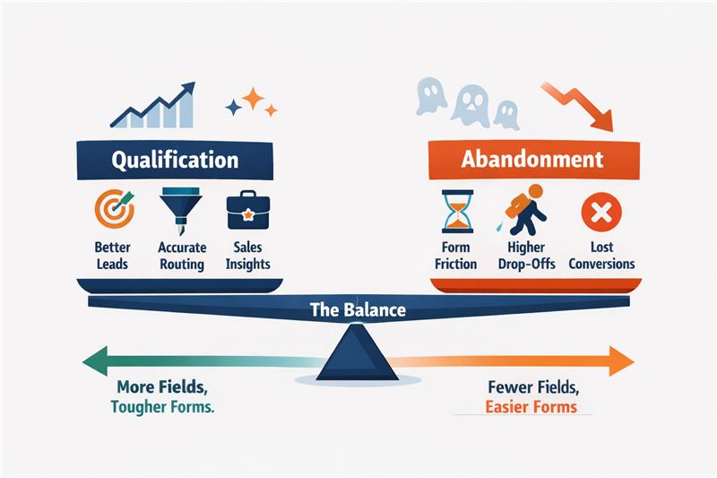
Most B2B funnels break at the form. Teams keep adding fields like company size, job title, phone number, and budget, hoping better data will improve lead quality. Instead, conversion rates drop and demo requests slow down. What started as a qualification step becomes a friction point. Every additional field increases effort, hesitation, or privacy concerns, quietly pushing legitimate prospects away before they ever submit the form.
Lead forms sit at the centre of the funnel, which creates a constant trade-off. Collect too little information, and sales receive unqualified leads. Collect too much, and potential customers abandon the form. The real challenge is knowing which fields genuinely improve qualification and which ones only create friction. This blog breaks down that difference and explains how to design forms that capture leads without hurting conversions.
Read more: Why Enterprise AI Fails and How to Fix It
Most long lead forms are not designed intentionally. They grow over time. The form becomes a place for data collection rather than a mechanism for moving prospects through the funnel. Understanding why teams add these fields is the first step to identifying which ones actually create value.
Read more: Executive Guide to Measuring AI ROI and Payback Periods
Most B2B teams design forms with a single objective: To improve lead quality. Additional fields are added to capture firmographic data, assess intent, or help sales prioritise outreach. Over time, the form becomes longer, the questions become more detailed, and the assumption remains the same: more information should produce better leads.
This is where the core trade-off emerges.
Understanding this trade-off helps teams evaluate whether a field actually improves decision-making or simply adds friction.
| Aspect | Qualification | Abandonment |
| Definition | The process of identifying whether a lead fits the company’s ideal customer profile or purchasing potential. | The point at which a user leaves the form without submitting it. |
| Purpose in the funnel | Helps sales prioritise leads and allocate time to higher-value opportunities. | Reduces the number of captured leads, weakening the top of the funnel. |
| Typical triggers | Fields like company name, job title, or company size that provide useful context for sales teams. | Long forms, sensitive questions, or complex dropdowns that increase effort or discomfort. |
| User perception | Users feel they are providing relevant information to request a demo or contact sales. | Users feel the form requires too much effort or asks for unnecessary personal or company data. |
| Impact on conversion rates | Moderate qualification fields may slightly reduce conversions but improve lead quality. | Excessive or poorly chosen fields significantly increase drop-off rates. |
| Design implication | Fields should only exist if they help a meaningful sales or routing decision. | Any field that does not influence decisions becomes unnecessary friction. |
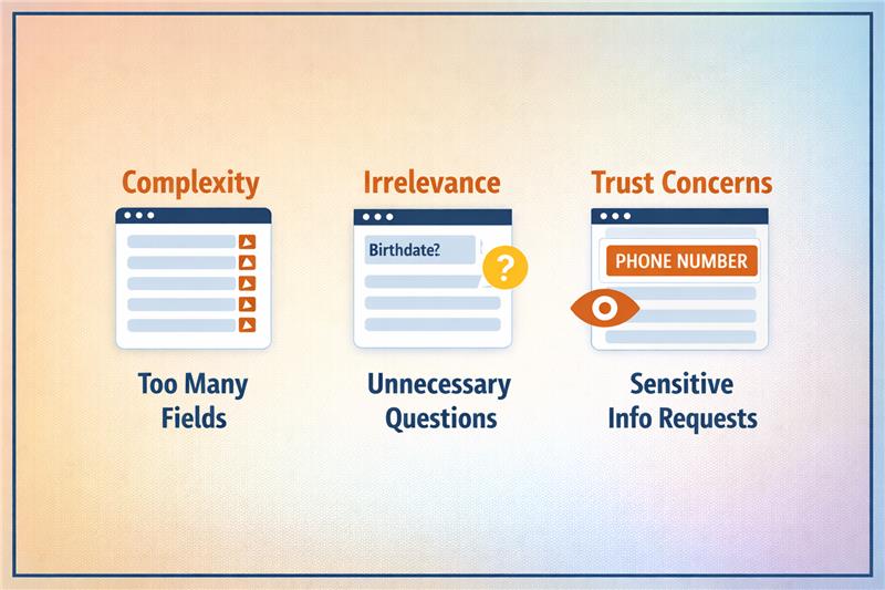
Form abandonment happens when the form introduces friction that feels unnecessary or uncomfortable. Small moments of hesitation accumulate as the user progresses through the form. When the perceived effort becomes higher than the expected value, users exit the flow.
Three behavioural triggers typically drive this drop-off:
Some fields immediately create hesitation because users worry about how the information will be used. Questions that appear sensitive or intrusive increase perceived risk before trust is established.
Trigger: Fields such as phone numbers, revenue ranges, or personal contact details raise concerns about unwanted sales calls or data misuse, prompting users to abandon the form.
Certain questions require users to pause, think, or estimate information they may not know immediately. When a form demands too much mental effort, the completion process slows down.
Trigger: Complex dropdown menus, unclear categories, or questions like company revenue or employee ranges increase cognitive load and discourage users from finishing the form.
Some information is useful later in the sales process but appears too early in the initial conversion step. When advanced qualification questions appear prematurely, users feel they are entering a long evaluation process.
Trigger: Asking detailed requirements, budget ranges, or implementation timelines during the first interaction creates friction because the user has not yet committed to deeper engagement.
The goal is not to eliminate qualification from the form but to focus on fields that deliver decision value without creating unnecessary resistance. When forms prioritise these signals, teams gain useful context while keeping the submission experience manageable for the user.
Read more: How to Deploy Private LLMs Securely in Enterprises
Identifying and removing the right form fields reduce friction while maintaining the information that genuinely supports qualification.
Read more: How to Deploy Private LLMs Securely in Enterprises
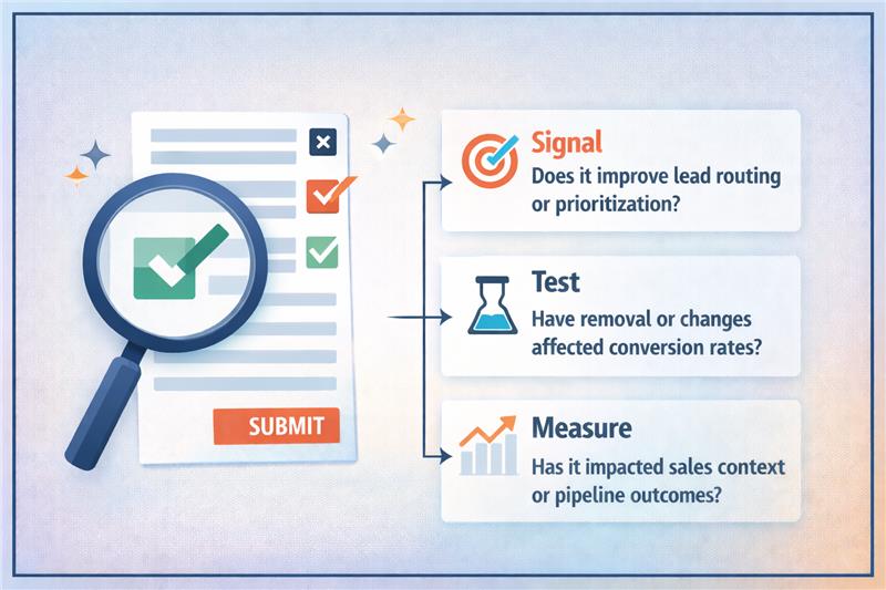
The most practical approach is to assess every form field through a signal versus friction lens. Signal represents the decision value the field provides, while friction represents the effort or hesitation it introduces for the user. When teams analyse fields using this framework, it becomes easier to separate necessary qualification questions from unnecessary data requests.
Read more: Modern AI Data Stack Architecture Explained for Enterprises
The objective is to understand how each field affects both conversion behaviour and downstream pipeline outcomes. This requires measuring not only form completion rates but also how those leads progress through the sales process. When testing is done carefully, teams can improve conversion rates without sacrificing qualification quality.
Read more: Personalization vs Borad UX Changes in Conversion Rate Optimization Services
Lead forms should capture decisions, not excess data. Every field must justify its presence by improving routing, prioritisation, or sales context. When forms collect information that does not influence these decisions, friction increases and conversion rates drop. The most effective funnels focus on a small set of high-signal fields that capture intent without slowing users down.
Improving forms requires a disciplined approach: evaluate each field for signal, test changes carefully, and measure both conversion rates and downstream pipeline outcomes. When designed correctly, forms become a fast entry point rather than a barrier. If your funnel is struggling with form friction or qualification trade-offs, Linearloop helps teams design and optimise conversion flows that improve both lead capture and pipeline quality.
Mayur Patel
Mar 11, 20266 min read

How to Optimise Demo Request Flows Without Disrupting Sales Infrastructure
Experimenting with demo request flows is risky for most B2B teams. A small change to a form can break lead routing, override territory rules, double-book SDR calendars, or corrupt CRM records. Since demo requests trigger multiple operational systems at once, many teams avoid testing entirely. This results in high-intent conversion points remaining untouched, even when conversion rates could clearly improve.
Yet demo request forms sit at the most valuable moment in the funnel, when a visitor is ready to talk to sales. Improving this step can directly increase the qualified pipeline. The challenge is running experiments without disrupting routing logic, territory ownership, or calendar availability. This blog explains how teams can test demo request flows safely while keeping their sales infrastructure intact.
Read more: Personalization vs Borad UX Changes in Conversion Rate Optimization Services
Demo request flows sit directly on top of sales infrastructure. The moment a visitor submits a demo request, multiple operational systems activate simultaneously. Because these systems depend on specific fields and routing logic, even small changes to the form can break downstream processes.
Read more: Modern AI Data Stack Architecture Explained for Enterprises
Experimenting with demo request flows can easily disrupt sales operations. These forms sit at the junction of marketing and sales infrastructure, triggering routing engines, CRM records, and scheduling systems simultaneously. When teams modify form fields, qualification logic, or scheduling steps without considering these dependencies, operational failures appear quickly. Leads may route incorrectly, ownership rules can break, and booking flows can fail before a meeting is even scheduled.
The most common issue is incorrect lead assignment. Routing systems rely on specific inputs such as geography, company size, or industry. If experiments remove or change these fields, leads can bypass routing rules and land with the wrong representative. Territory conflicts follow, especially in organisations with strict regional ownership.
These failures affect more than operations. SDR teams experience overloaded calendars or missed follow-ups. CRM data becomes inconsistent when records map incorrectly or duplicate entries appear. Pipeline reporting also suffers because demo requests may not be attributed properly to campaigns or sales teams. Revenue forecasts, conversion analysis, and performance tracking become unreliable. The solution is designing tests that respect routing logic, territory ownership, and sales infrastructure dependencies.
Read more: How to Deploy Private LLMs Securely in Enterprises
Teams often identify friction in demo request flows but hesitate to experiment because these forms sit on top of critical sales infrastructure. Even small UI changes can affect routing rules, territory ownership, or scheduling logic. Many CRO ideas can improve conversions, but if implemented without operational safeguards, they can disrupt CRM workflows and sales execution.
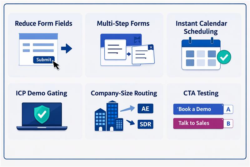
| Experiment | What changes | Conversion upside | Operational risk |
| Reduce form fields | Remove fields like company size or industry | Lower friction, higher submissions | Routing rules lose required inputs |
| Multi-step forms | Break long forms into steps | Higher completion rates | Partial data can break routing or CRM mapping |
| Instant calendar scheduling | Show rep calendars immediately | Faster meeting booking | Wrong routing exposes incorrect calendars |
| ICP demo gating | Allow scheduling only for qualified leads | Higher lead quality for sales | Qualification logic can conflict with routing |
| Company-size routing | Route enterprise leads to AEs | Faster sales response | Incorrect data misroutes territories |
| CTA testing | “Book a demo” vs “Talk to sales” | Higher click and submit rates | Intent signals may disrupt qualification workflows |
Read more: RAG vs Fine-Tuning: Cost, Compliance, and Scalability Explained
Demo request flows should be treated as sales infrastructure. The safest way to experiment is to separate the experimentation layer from the operational layer that controls routing, territories, calendars, and CRM workflows. When these layers remain independent, teams can test improvements without disrupting sales execution.
Routing systems depend on structured data fields to determine ownership, territory assignment, and follow-up workflows. Experiments should never remove or corrupt the inputs these systems require.
Reducing form friction is a common experiment, but routing systems still require company-level data. Enrichment allows teams to shorten forms while preserving operational inputs.
Running experiments across all traffic increases operational risk. Limiting tests to defined segments helps isolate potential failures without affecting the entire pipeline.
Build routing safeguards before running tests
Operational safeguards ensure leads continue to reach sales teams even if an experiment fails or routing logic behaves unexpectedly.
Monitor operational metrics
Demo flow experiments should not be judged solely on form conversion performance. Operational stability and sales efficiency must also be monitored.
Read more: Executive Guide to Measuring AI ROI and Payback Periods
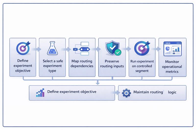
Running experiments on demo request flows requires a controlled workflow. The experiment should modify the user experience while keeping the routing, CRM mapping, and calendar systems unchanged.
The example below shows how a team tests a multi-step demo form while preserving routing inputs through enrichment and keeping backend assignment logic intact.
Read more: Why Enterprise AI Fails and How to Fix It
Demo request flows are deeply integrated with sales infrastructure. Routing engines, territory ownership rules, CRM workflows, and SDR calendars all depend on the data these forms generate. This is why many teams avoid experimentation altogether. The real challenge is how to experiment without disrupting the systems that turn demo requests into a pipeline.
When experimentation is separated from routing logic, teams can safely optimise these high-intent conversion points. Preserving routing inputs, using enrichment, running controlled experiments, and monitoring operational metrics allow improvements without operational risk. If your team wants to improve demo conversion without breaking sales systems, Linearloop helps design experimentation frameworks that protect routing logic while enabling continuous optimisation.
Mayur Patel
Mar 9, 20266 min read
