We're officially a Great Place To Work® certified company, India | 2026–27
Mayank Patel
Apr 24, 2025
6 min read
Last updated Apr 24, 2025

Microservices have evolved from a tech buzzword to a practical architectural choice for modern ecommerce businesses. But for retailers, especially D2C brands navigating scale, personalization, and agility, implementing microservices isn't just about choosing a new tech stack—it's about redesigning how your organization ships value to customers. This guide doesn’t aim to glorify microservices but to dissect the actual process of implementing them in a way that avoids common pitfalls and aligns with retail business goals.

Retail, particularly ecommerce, is a battlefield of real-time demand shifts, multichannel orchestration, and aggressive experimentation. Monolithic systems, even well-built ones, struggle under this pressure. Microservices promise faster iterations, specialized scalability, and cleaner team autonomy—but more importantly, they map well to the modular nature of retail domains.
Think about it:
Decoupling these capabilities into independent services allows for parallel development, better fault isolation, and easier third-party integration. But these benefits only accrue when the migration and operational maturity align with business needs.
Also read: CDPs vs CRMs vs DMPs
Microservices start with people, not code. Conway’s Law—"organizations design systems that mirror their communication structures"—applies hard here. Teams that aren’t organized around business capabilities will find it hard to own microservices end-to-end. Before writing a single line of service code:
Avoid the trap of building microservices with a shared database or centralized deployment team. That’s just a monolith in disguise.
If this transformation feels daunting, you're not alone—we can help you plan, architect, and even implement this journey end-to-end, tailored to your business needs. Book a time now.
Here’s a structured approach to implementation that balances technical rigor with business continuity.
Start with mapping out domain boundaries:
Deliverable: A domain map showing logical service boundaries, ideal team mappings, and coupling hotspots.

Also Read: How to Handle SKUs with No Historical Data (e.g., New Drops, Collabs)
Before building services:
Think of each service as a public API product, even if it’s only consumed internally.
Avoid boiling the ocean. Choose a business capability that:
Example: Refactor the Search & Recommendations feature into a standalone service. It’s critical for conversions, yet usually interacts minimally with transactional systems.
Goals:
Also Read: Why Retail Tech Needs to Think in Probability, Not Certainty
Once the pilot proves successful, scale to core commerce flows:
Use a strangler pattern—let new microservices intercept parts of the monolith gradually. Route only specific requests to the service and expand coverage as confidence grows.
Microservices need a reliable platform to thrive. Skimping here will lead to unstable systems and operational chaos.
Security, compliance, and governance can’t be afterthoughts. Invest in API gateways, zero-trust networking, and encrypted service-to-service communication from day one.
Also Read: How Gen Z is Forcing Retailers to Rethink Digital Strategy
Data is the thorniest part of microservices in retail. Here’s how to handle it practically:
Beyond engineering success, microservices should move the needle for business outcomes.
Business KPIs:
Technical KPIs:
Retailers shouldn’t approach microservices like a single replatforming event. Instead, treat it like progressive renovation. Prioritize customer-impacting services, learn from each rollout, and keep feedback loops tight between engineering and business teams.
")
Why Some Lead Form Fields Kill Conversions (And Which Ones Actually Help)
Most B2B funnels break at the form. Teams keep adding fields like company size, job title, phone number, and budget, hoping better data will improve lead quality. Instead, conversion rates drop and demo requests slow down. What started as a qualification step becomes a friction point. Every additional field increases effort, hesitation, or privacy concerns, quietly pushing legitimate prospects away before they ever submit the form.
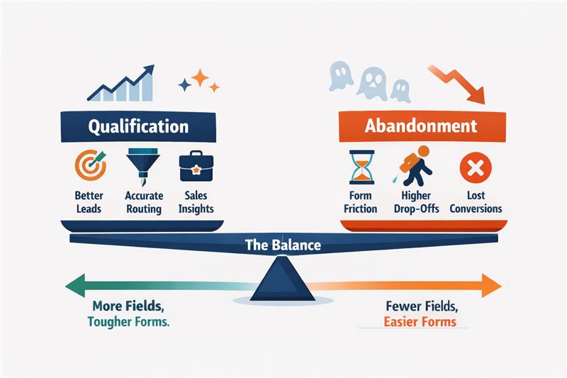
Lead forms sit at the centre of the funnel, which creates a constant trade-off. Collect too little information, and sales receive unqualified leads. Collect too much, and potential customers abandon the form. The real challenge is knowing which fields genuinely improve qualification and which ones only create friction. This blog breaks down that difference and explains how to design forms that capture leads without hurting conversions.
Read more: Why Enterprise AI Fails and How to Fix It
Most long lead forms are not designed intentionally. They grow over time. The form becomes a place for data collection rather than a mechanism for moving prospects through the funnel. Understanding why teams add these fields is the first step to identifying which ones actually create value.
Read more: Executive Guide to Measuring AI ROI and Payback Periods
Most B2B teams design forms with a single objective: To improve lead quality. Additional fields are added to capture firmographic data, assess intent, or help sales prioritise outreach. Over time, the form becomes longer, the questions become more detailed, and the assumption remains the same: more information should produce better leads.
This is where the core trade-off emerges.
Understanding this trade-off helps teams evaluate whether a field actually improves decision-making or simply adds friction.
| Aspect | Qualification | Abandonment |
| Definition | The process of identifying whether a lead fits the company’s ideal customer profile or purchasing potential. | The point at which a user leaves the form without submitting it. |
| Purpose in the funnel | Helps sales prioritise leads and allocate time to higher-value opportunities. | Reduces the number of captured leads, weakening the top of the funnel. |
| Typical triggers | Fields like company name, job title, or company size that provide useful context for sales teams. | Long forms, sensitive questions, or complex dropdowns that increase effort or discomfort. |
| User perception | Users feel they are providing relevant information to request a demo or contact sales. | Users feel the form requires too much effort or asks for unnecessary personal or company data. |
| Impact on conversion rates | Moderate qualification fields may slightly reduce conversions but improve lead quality. | Excessive or poorly chosen fields significantly increase drop-off rates. |
| Design implication | Fields should only exist if they help a meaningful sales or routing decision. | Any field that does not influence decisions becomes unnecessary friction. |
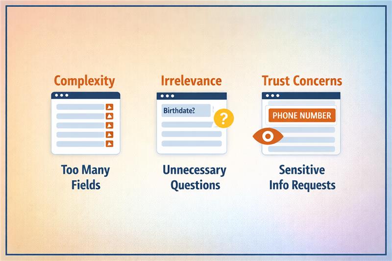
Form abandonment happens when the form introduces friction that feels unnecessary or uncomfortable. Small moments of hesitation accumulate as the user progresses through the form. When the perceived effort becomes higher than the expected value, users exit the flow.
Three behavioural triggers typically drive this drop-off:
Some fields immediately create hesitation because users worry about how the information will be used. Questions that appear sensitive or intrusive increase perceived risk before trust is established.
Trigger: Fields such as phone numbers, revenue ranges, or personal contact details raise concerns about unwanted sales calls or data misuse, prompting users to abandon the form.
Certain questions require users to pause, think, or estimate information they may not know immediately. When a form demands too much mental effort, the completion process slows down.
Trigger: Complex dropdown menus, unclear categories, or questions like company revenue or employee ranges increase cognitive load and discourage users from finishing the form.
Some information is useful later in the sales process but appears too early in the initial conversion step. When advanced qualification questions appear prematurely, users feel they are entering a long evaluation process.
Trigger: Asking detailed requirements, budget ranges, or implementation timelines during the first interaction creates friction because the user has not yet committed to deeper engagement.
The goal is not to eliminate qualification from the form but to focus on fields that deliver decision value without creating unnecessary resistance. When forms prioritise these signals, teams gain useful context while keeping the submission experience manageable for the user.
Read more: How to Deploy Private LLMs Securely in Enterprises
Identifying and removing the right form fields reduce friction while maintaining the information that genuinely supports qualification.
Read more: How to Deploy Private LLMs Securely in Enterprises
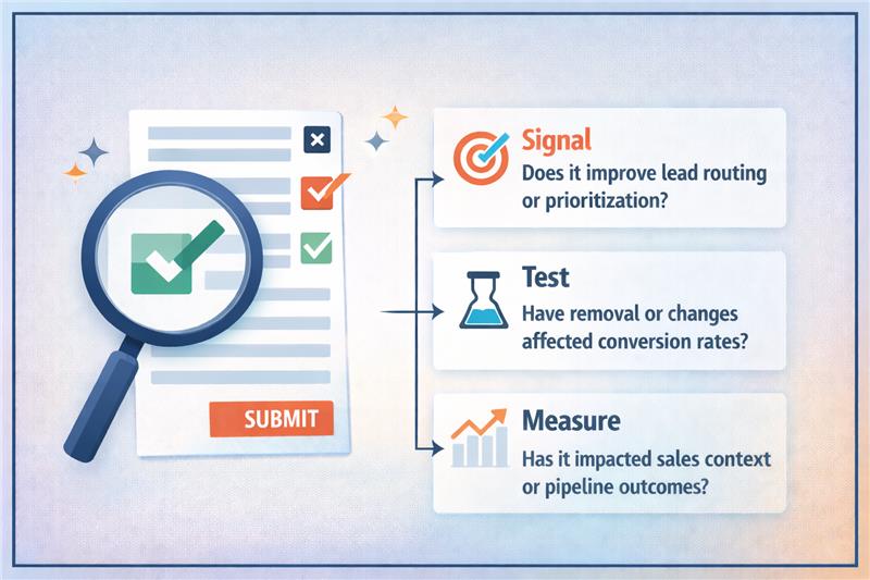
The most practical approach is to assess every form field through a signal versus friction lens. Signal represents the decision value the field provides, while friction represents the effort or hesitation it introduces for the user. When teams analyse fields using this framework, it becomes easier to separate necessary qualification questions from unnecessary data requests.
Read more: Modern AI Data Stack Architecture Explained for Enterprises
The objective is to understand how each field affects both conversion behaviour and downstream pipeline outcomes. This requires measuring not only form completion rates but also how those leads progress through the sales process. When testing is done carefully, teams can improve conversion rates without sacrificing qualification quality.
Read more: Personalization vs Borad UX Changes in Conversion Rate Optimization Services
Lead forms should capture decisions, not excess data. Every field must justify its presence by improving routing, prioritisation, or sales context. When forms collect information that does not influence these decisions, friction increases and conversion rates drop. The most effective funnels focus on a small set of high-signal fields that capture intent without slowing users down.
Improving forms requires a disciplined approach: evaluate each field for signal, test changes carefully, and measure both conversion rates and downstream pipeline outcomes. When designed correctly, forms become a fast entry point rather than a barrier. If your funnel is struggling with form friction or qualification trade-offs, Linearloop helps teams design and optimise conversion flows that improve both lead capture and pipeline quality.
Mayur Patel
Mar 11, 20266 min read

How to Optimise Demo Request Flows Without Disrupting Sales Infrastructure
Experimenting with demo request flows is risky for most B2B teams. A small change to a form can break lead routing, override territory rules, double-book SDR calendars, or corrupt CRM records. Since demo requests trigger multiple operational systems at once, many teams avoid testing entirely. This results in high-intent conversion points remaining untouched, even when conversion rates could clearly improve.
Yet demo request forms sit at the most valuable moment in the funnel, when a visitor is ready to talk to sales. Improving this step can directly increase the qualified pipeline. The challenge is running experiments without disrupting routing logic, territory ownership, or calendar availability. This blog explains how teams can test demo request flows safely while keeping their sales infrastructure intact.
Read more: Personalization vs Borad UX Changes in Conversion Rate Optimization Services
Demo request flows sit directly on top of sales infrastructure. The moment a visitor submits a demo request, multiple operational systems activate simultaneously. Because these systems depend on specific fields and routing logic, even small changes to the form can break downstream processes.
Read more: Modern AI Data Stack Architecture Explained for Enterprises
Experimenting with demo request flows can easily disrupt sales operations. These forms sit at the junction of marketing and sales infrastructure, triggering routing engines, CRM records, and scheduling systems simultaneously. When teams modify form fields, qualification logic, or scheduling steps without considering these dependencies, operational failures appear quickly. Leads may route incorrectly, ownership rules can break, and booking flows can fail before a meeting is even scheduled.
The most common issue is incorrect lead assignment. Routing systems rely on specific inputs such as geography, company size, or industry. If experiments remove or change these fields, leads can bypass routing rules and land with the wrong representative. Territory conflicts follow, especially in organisations with strict regional ownership.
These failures affect more than operations. SDR teams experience overloaded calendars or missed follow-ups. CRM data becomes inconsistent when records map incorrectly or duplicate entries appear. Pipeline reporting also suffers because demo requests may not be attributed properly to campaigns or sales teams. Revenue forecasts, conversion analysis, and performance tracking become unreliable. The solution is designing tests that respect routing logic, territory ownership, and sales infrastructure dependencies.
Read more: How to Deploy Private LLMs Securely in Enterprises
Teams often identify friction in demo request flows but hesitate to experiment because these forms sit on top of critical sales infrastructure. Even small UI changes can affect routing rules, territory ownership, or scheduling logic. Many CRO ideas can improve conversions, but if implemented without operational safeguards, they can disrupt CRM workflows and sales execution.
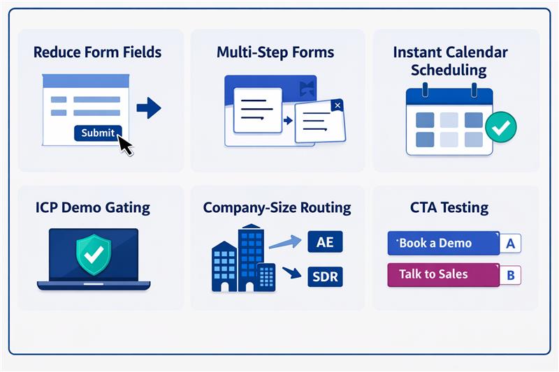
| Experiment | What changes | Conversion upside | Operational risk |
| Reduce form fields | Remove fields like company size or industry | Lower friction, higher submissions | Routing rules lose required inputs |
| Multi-step forms | Break long forms into steps | Higher completion rates | Partial data can break routing or CRM mapping |
| Instant calendar scheduling | Show rep calendars immediately | Faster meeting booking | Wrong routing exposes incorrect calendars |
| ICP demo gating | Allow scheduling only for qualified leads | Higher lead quality for sales | Qualification logic can conflict with routing |
| Company-size routing | Route enterprise leads to AEs | Faster sales response | Incorrect data misroutes territories |
| CTA testing | “Book a demo” vs “Talk to sales” | Higher click and submit rates | Intent signals may disrupt qualification workflows |
Read more: RAG vs Fine-Tuning: Cost, Compliance, and Scalability Explained
Demo request flows should be treated as sales infrastructure. The safest way to experiment is to separate the experimentation layer from the operational layer that controls routing, territories, calendars, and CRM workflows. When these layers remain independent, teams can test improvements without disrupting sales execution.
Routing systems depend on structured data fields to determine ownership, territory assignment, and follow-up workflows. Experiments should never remove or corrupt the inputs these systems require.
Reducing form friction is a common experiment, but routing systems still require company-level data. Enrichment allows teams to shorten forms while preserving operational inputs.
Running experiments across all traffic increases operational risk. Limiting tests to defined segments helps isolate potential failures without affecting the entire pipeline.
Build routing safeguards before running tests
Operational safeguards ensure leads continue to reach sales teams even if an experiment fails or routing logic behaves unexpectedly.
Monitor operational metrics
Demo flow experiments should not be judged solely on form conversion performance. Operational stability and sales efficiency must also be monitored.
Read more: Executive Guide to Measuring AI ROI and Payback Periods
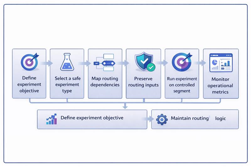
Running experiments on demo request flows requires a controlled workflow. The experiment should modify the user experience while keeping the routing, CRM mapping, and calendar systems unchanged.
The example below shows how a team tests a multi-step demo form while preserving routing inputs through enrichment and keeping backend assignment logic intact.
Read more: Why Enterprise AI Fails and How to Fix It
Demo request flows are deeply integrated with sales infrastructure. Routing engines, territory ownership rules, CRM workflows, and SDR calendars all depend on the data these forms generate. This is why many teams avoid experimentation altogether. The real challenge is how to experiment without disrupting the systems that turn demo requests into a pipeline.
When experimentation is separated from routing logic, teams can safely optimise these high-intent conversion points. Preserving routing inputs, using enrichment, running controlled experiments, and monitoring operational metrics allow improvements without operational risk. If your team wants to improve demo conversion without breaking sales systems, Linearloop helps design experimentation frameworks that protect routing logic while enabling continuous optimisation.
Mayur Patel
Mar 9, 20266 min read
