We're officially a Great Place To Work® certified company, India | 2026–27
Mayank Patel
Jan 21, 2025
4 min read
Last updated Dec 23, 2025

Imagine somebody lands on your website. They browse around, showing a bit of interest, but they're not ready to buy or commit. It's like trying to get someone to jump into the deep end when they haven't even dipped a toe in the water. This is where a smart online strategy steps in—borrowing a psychological trick to gently guide visitors into becoming customers. That's the strategy with the power of Conversion Rate Optimization, better known as CRO, combined with what is called the Foot-in-the-Door phenomenon.
Having trouble converting website visitors into customers? Well, Conversion Rate Optimization or CRO for short, makes your site better at getting people to act. But what if there was a way to make those "asks" feel easier? Enter the "Foot-in-the-Door" phenomenon: the surprising power of starting small to achieve big conversion wins.
Why does this "small ask" strategy actually work when someone's surfing the Web? It all comes down to the way our minds work.
First, there's consistency: people like to maintain harmony between their actions and beliefs. If a person clicks a button to download a free guide, he or she has taken a small step towards showing interest in something. The feeling of wanting to be consistent with that act now means they're likely to consider more steps regarding the subject. After all, they've already said 'yes' in a small way, making it harder to say 'no' to a slightly larger request.
Then there's self-perception: when someone takes a small action on your site, they start to view themselves in a certain light. Subscribing to your email list can lead them to think, 'I’m someone interested in this topic.’ That slight change in self-identity makes them more receptive to future engagement with your brand.
Crucially, small requests lower the perception of risk. Sharing an email address for a free download feels far less risky than entering credit card details for a purchase. This is a low-stakes way for someone to interact with you and see what you're offering without feeling pressured.
Finally, building a connection gradually avoids overwhelming visitors with a big sales pitch upfront... It will let you build trust and rapport over time before making them comfortable enough with your brand to make a bigger ask.
Also Read: What a Conversion Rate Optimization Agency Can Do for Your E-commerce Store
So how does that work in the real world of websites and online marketing? Well, here are a few examples of common CRO tactics which make very sly use of the Foot-in-the-Door principle:
Also Read: Custom Retail Software Solutions: A Comprehensive Guide
Strategically applying the Foot-in-the-Door phenomenon to your CRO efforts can significantly boost your website’s performance. So, start thinking about the small steps you can offer, and watch how those small actions lead to significant gains for your business. At Linearloop, we believe that every small step counts to yield significant gains in your marketing efforts. Our custom software solutions ensure your CRO strategies are effective and tailored to your business needs.

Why Teams Optimise Conversion Rate Instead of Revenue
Growth teams run constant experiments, celebrate higher conversion rates, and report improvements in form completions, demo requests, or trial sign-ups. Yet leadership often sees a different reality: revenue growth slows, pipeline quality stagnates, and profit margins remain unchanged. The issue is not a lack of experimentation; it is that teams optimise the easiest metric to move rather than the metric that reflects real business value.
Conversion rate became the default optimisation metric because it responds quickly to experiments, is easy to attribute to UI changes, and fits neatly into A/B testing workflows. Over time, experimentation programmes began optimising behavioural metrics simply because they were measurable and controllable. This creates a structural paradox where businesses care about revenue, profit, and qualified pipeline, but growth teams optimise conversion rate. This blog examines why that misalignment happens and why the metric itself deserves scrutiny.
Read more: Why Enterprise AI Fails and How to Fix It
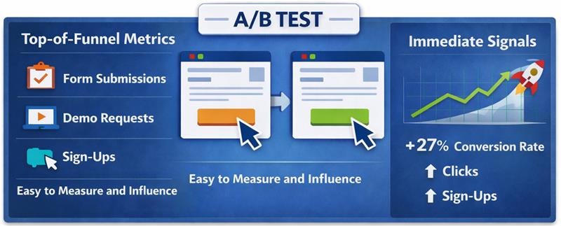
Conversion rate optimisation emerged as digital products and marketing funnels became fully measurable, allowing teams to track how users moved through landing pages, sign-up flows, checkout processes, and onboarding journeys. Instead of waiting for revenue reports or quarterly sales outcomes, teams could immediately see whether a page change increased form submissions, trial activations, or checkout completions. This visibility made conversion rate a practical optimisation target for marketing, product, and growth teams responsible for improving funnel performance.
Experimentation platforms accelerated this shift. A/B testing tools allowed teams to test headlines, layouts, pricing visibility, and form structures while measuring immediate behavioural outcomes. Because experiments required a fast success metric to determine winners, conversion rate became the most reliable signal. Teams could run tests frequently, observe results within days, and report measurable improvements through conversion lifts.
Over time, this experimentation culture established conversion rate as the default optimisation metric. Landing pages, signup flows, checkout experiences, and onboarding journeys were all evaluated based on whether conversions increased. Since the metric was simple to measure and responded quickly to interface changes, growth teams built experimentation programmes around improving conversion rate, gradually treating it as a growth indicator rather than a behavioural signal within a broader revenue system.
Read more: Executive Guide to Measuring AI ROI and Payback Periods
Conversion rate is a behavioural metric that measures the proportion of users who complete a predefined action within a digital journey. It helps teams understand whether visitors respond to a page, message, or product flow, but it does not reveal whether those actions generate business value. The metric captures user behaviour inside the funnel.
Read more: How to Deploy Private LLMs Securely in Enterprises
Most organisations do not intentionally prioritise conversion rate over revenue or pipeline. The metric becomes dominant because it fits how experimentation, reporting, and team responsibilities are structured. Conversion rate responds quickly to changes, is easy to attribute to specific actions, and sits within the direct control of marketing and growth teams.
Read more: How to Deploy Private LLMs Securely in Enterprises
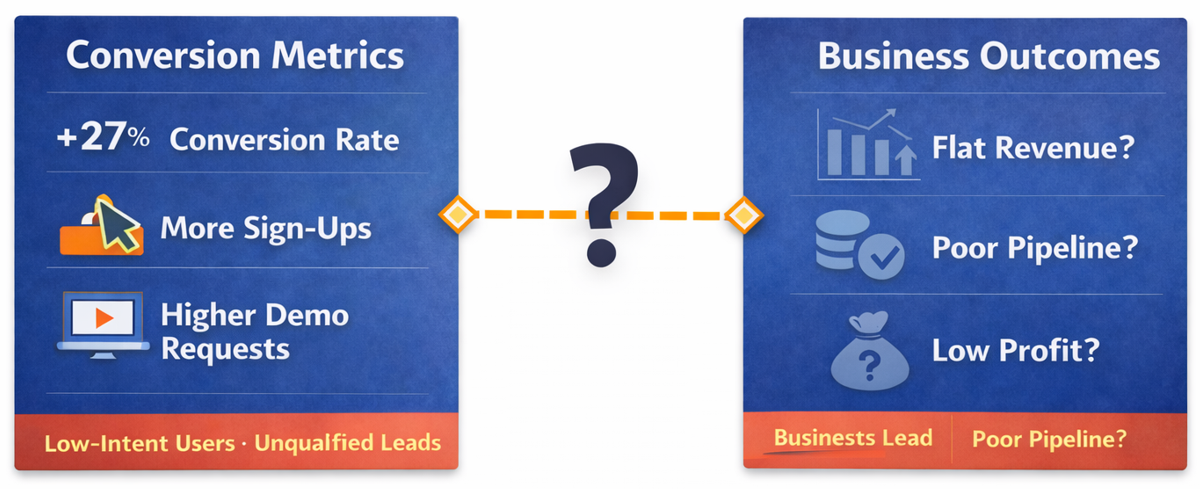
Higher conversions often create the appearance of growth, but the metric measures behaviour inside the funnel rather than the value created after the action occurs. A landing page may generate more demo requests, a signup flow may produce more trial users, or a checkout page may record more completed transactions, yet these improvements do not automatically translate into stronger revenue, healthier margins, or a higher-quality pipeline. When teams treat conversion rate as the primary success metric, they risk optimising user actions that do not necessarily contribute to business performance.
This gap emerges when optimisation metrics are misaligned with business outcomes. Experiments that increase conversions can attract lower-intent users, generate leads that do not qualify for sales, or encourage transactions that require heavy discounting and reduce margins. In such cases, the conversion metric improves while the economic result weakens, because the optimisation process prioritises behavioural responses instead of evaluating whether those responses create measurable financial value.
Read more: Modern AI Data Stack Architecture Explained for Enterprises
Conversion improvements often appear positive in experiment dashboards, but the metric alone does not indicate whether the underlying business outcome improved. When optimisation focuses only on increasing conversions, experiments can unintentionally attract the wrong users, reduce economic value, or distort the signals that leadership relies on to evaluate growth performance.
Read more: Personalization vs Borad UX Changes in Conversion Rate Optimization Services
Revenue and profit represent the outcomes businesses ultimately care about, yet these metrics are difficult to optimise through isolated experiments because they depend on multiple interconnected factors across the entire customer lifecycle. Unlike conversion rate, which responds immediately to interface changes, revenue and profitability emerge from a combination of pricing decisions, customer quality, retention behaviour, and operational costs that extend far beyond a single page or funnel step.
Read more: Why Some Lead Form Fields Kill Conversion
In B2B growth systems, conversions and pipeline represent very different signals, yet many teams treat them as the same indicator of demand. Metrics like demo requests or form submissions only reflect top-of-funnel activity, not real sales progress. What ultimately matters is whether those leads qualify and move into opportunities. Measuring sales-qualified pipeline instead of raw conversions aligns growth efforts with revenue potential.
| Dimension | Conversion-focused growth | Pipeline-focused growth |
| Primary metric | Form submissions, demo requests, or sign-ups recorded at the top of the funnel. | Sales-qualified opportunities that meet defined criteria and enter the pipeline. |
| Objective | Increase the number of users completing a marketing action. | Increase the number of opportunities with real purchasing potential. |
| Lead quality | Often includes low-intent or exploratory leads. | Prioritises leads that meet qualification standards. |
| Business impact | Activity increases but sales outcomes may remain unchanged. | Directly reflects potential revenue generation. |
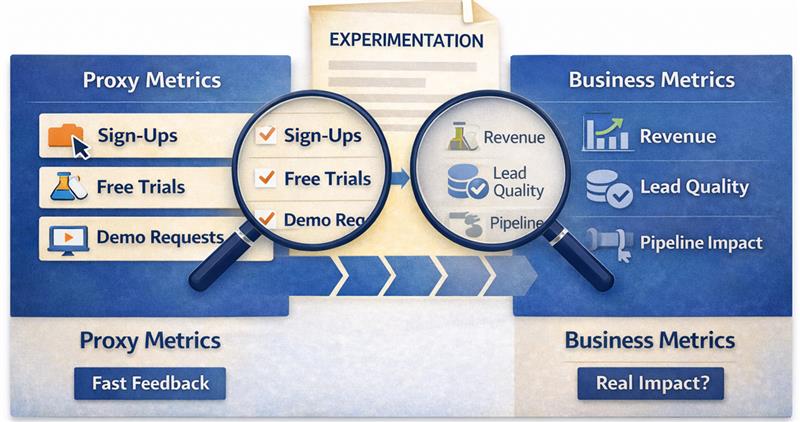
Proxy metrics exist because experimentation requires fast signals that indicate whether a change influences user behaviour before the final business outcome becomes visible. Metrics such as click-through rate, form completion, or conversion rate provide immediate feedback about how users respond to a page, message, or flow, allowing teams to evaluate experiments within short timeframes. In this context, conversion rate functions as a proxy for potential business impact because it captures behavioural movement within the funnel, even though the actual outcome may only appear much later.
The risk emerges when proxy metrics begin replacing the business metrics they are meant to approximate. When experimentation programmes treat conversion rate as the primary success indicator, teams may optimise behavioural responses without evaluating whether those responses create economic value. Experiments can therefore produce consistent improvements in proxy metrics while revenue growth, pipeline quality, or profitability remain unchanged. Over time, excessive reliance on proxy metrics shifts optimisation away from business outcomes and toward behavioural signals that only partially represent the true performance of the growth system.
Read more: From Custom Builds to 60 Stores: BVB Media Ecommerce Platform Story
Growth programmes become misaligned when behavioural metrics sit at the top of the optimisation hierarchy instead of supporting business outcomes. A more reliable approach is to organise metrics in layers so that experimentation signals connect directly to economic impact.
In this structure, behavioural metrics help diagnose user behaviour, economic metrics connect behaviour to value creation, and business metrics represent the final outcomes the organisation ultimately cares about.
Business metrics represent the final economic results produced by the growth system. These metrics define whether the business is creating sustainable value rather than simply increasing activity within the funnel.
Economic metrics translate behavioural activity into financial impact, helping teams understand whether changes in user behaviour improve revenue potential or pipeline quality.
Behavioural metrics provide immediate feedback about how users respond to interface changes, messaging adjustments, or product flow improvements.
Read more: How to Optimize Demo Request Flows Without Disrupting Sales Infrastructure
When the objective shifts from improving conversion rate to improving business outcomes, the way experiments are designed and evaluated changes significantly. Instead of measuring success through immediate behavioural responses alone, teams begin examining whether experiments increase revenue potential, improve lead quality, or strengthen the pipeline.
Read more: How Linearloop Built a Zero Loss ERP for a Gold Refinery
Conversion rate is a useful behavioural signal, but it cannot be the final objective of a growth programme. When teams optimise only for conversions, they often increase funnel activity without improving revenue, pipeline quality, or profitability. Sustainable experimentation requires aligning behavioural metrics with economic impact and ultimately with business outcomes.
Growth teams therefore need experimentation frameworks that connect user behaviour to measurable business value. Experiments should be evaluated through revenue contribution, lead quality, and pipeline impact rather than isolated conversion lifts. If your organisation is rethinking how experimentation aligns with real growth outcomes, Linearloop helps teams design optimisation systems that link product changes, behavioural signals, and revenue impact.
Mayur Patel
Mar 13, 20265 min read

7 signs you should opt for UI/UX Audit
In a time when virtual interactions shape how users connect, emphasizing a meticulously designed user interface (UI) alongside an enriching user experience (UX) holds immense significance. As companies aim to reach new heights in their digital endeavors, the necessity for continuous assessments rises to the forefront.
Engaging in a UI/UX audit emerges as an invaluable resource designed to confirm that your website or application fulfills user desires while resonating with corporate aspirations. Throughout this discussion, we shall investigate seven indicators that suggest the moment has arrived to ponder a UI/UX audit for your digital platform.
Before delving deep into the signals that call for such a review, it’s important to shed light on what constitutes a UI/UX audit. This thorough inspection encompasses a wide array of elements pertaining to your website or application, spanning design appeal, ease of use, functionality, and overall user contentment. The essential aim of this assessment revolves around uncovering opportunities for enhancements capable of enriching the user experience and ultimately boosting conversions.
Typically, a UX audit unfolds through diverse methods, including heuristic assessments, user experience trials, and meticulous data evaluation. By harnessing these approaches, organizations can unravel insights regarding how individuals engage with their platforms while pinpointing challenges that might obstruct their satisfaction. Continuous evaluations are indispensable for nurturing a successful user experience, ensuring that your platform retains its place in a swiftly changing digital arena.
Probably the most telling indicator that you need a website UI/UX audit is when you notice high drop-off rates on your site. Drop-off rates refer to the number of users who leave your site after having viewed only one page. If users exit and do not complete the desired actions, such as signing up for a newsletter or making a purchase, the reason for such has to be investigated.
High drop-off rates can often result from bad navigation, slow loading, or poor on-page content. It may be conducive to pinpointing such issues in the user journey, and a UI/UX audit might urge users to abandon their sessions because users find the navigation too poor to navigate toward finding what they're looking for, for example. Thus, an audit could give recommendations that would smoothen the user flow and hence improve usability in general.
Also Read: Mobile App Design Fundamentals: Difference between UI and UX
Apart from being complex, another surefire way to know something is off with your UI/UX is low conversion rates. Conversion rates measure the amount of visitors who take a desired action on your site-it could be filling out a form, subscription for something, or even a sale. If you see users traffic your site but fail/are not converting, that may be high time for an e-commerce UX/UI audit.
Poor calls-to-action, poorly communicated value propositions, and checkout flows that are unnecessarily convoluted are some of the possible causes. A comprehensive UI/UX audit will grade each of these items and give some recommendations for ways to improve those elements. Businesses stand to see huge improvements in conversion rates-driving revenue growth by addressing these issues and implementing best practices based on data-driven recommendations.
User feedback is supremely valuable to gauge the effectiveness of a UI/UX design. If you keep getting negativity about the usability or look and feel, that's a sure-shot signal toward the need for a UX design audit. Negative reviews left on Google or other social media show pain points that may be masked in analytics.
These will help explain in greater detail the experiences and frustrations of the users through questionnaires or interviews. A proper UI/UX audit will observe and find common trends from user feedback. Understand what users don't like about their experience, be it sluggish page load time, confusion over the layout, or lack of mobile optimization.
In the digital world, design trends emerge and disappear in the blink of an eye. That thing that seemed the most innovative some time ago is now perceived as outdated. If your website or application looks stale compared to the competition or doesn't adopt modern design principles, then it's time for renewal. This UI/UX audit report will grade how fresh the current design is, recommending updates in line with contemporary standards.
An obsolete design interferes with the aesthetic sphere, and functionality, and with users' trust in general. Users relate modern designs to reliability and professionalism; if your platform looks old, they will question its credibility. A full-scale UI/UX audit shall help you find where updates are due to refreshed color scheme, updated typography, or improved responsive design features to ensure that your platform meets the expectations of today.
Your UI/X should efficiently support your business objectives. If you recognize that the design of your platform is not in support of strategic goals, such as increased brand awareness or sales, now may be the time for a UI/UX audit. A successful audit will gauge how well your existing design serves these goals and propose improvements in the name of creating synergy between UX and business objectives.
For example, if a business objective involves increasing customer loyalty, but a website lacks personalization features or targeted content for repeat visitors, then that would be shown in an audit. Matching UX strategies with business goals requires actionable insights from the auditing process in order to enable organizations to create more substantial interactions with users and develop long-term relationships.
Also Read: Wireframe vs Mockup vs Prototype - What's the Difference?
Generally speaking, any sudden increase in the number of customer support requests is very often a signal of deeper usability issues. If users find it difficult to work with your platform, or if their use is disrupted with errors like broken links and forms that are not very intuitive, then they would turn to support more often. An audit of UX UI in WordPress may discover the problems of usability and give way to a seamless user experience.
Analyzing support requests helps organizations in spotting the problems most of their users are bumping into. Suppose a large number of customers say they want to find some information on your website. That could imply something about navigation, or that the content is poorly sorted. A full-scale UI/UX audit would find these usability issues and give suggestions for improvements toward ease of understanding and navigation across the entire platform.
Lastly, when your metrics of user engagement begin to stagnate or fall-for instance, time spent on the site or a number of pages viewed per session is the time to act. With respect to finding a strategy for engaging users, taking control of UI/UX requires ongoing assessment and adaptation. A complete UI UX audit checklist makes sure the fallen engagement finds a way to restore interest in your platform.
Of the many key performance indicators that show the level of good interaction with your users, engagement metrics are the most important. If they are not able to spend enough time on your website or navigate through other pages than your homepage, it may be that they don't believe in the value of what you offer.
A good UI/UX design audit will take a closer look at these metrics, plus some qualitative data from user feedback, to come up with strategies aimed at improving engagement: showing better content interaction, interactive features, or personalized experiences.
Recognizing these seven signs will help you keep an effective digital presence that will surely meet users' needs and drive business success. A UI/UX audit report not only identifies issues but provides actionable insights necessary for a strategic improvement in user experience. Here at Linearloop, our specialty is full-cycle UI UX audit services, and we support businesses like yours to optimize your platforms toward maximum effect.
Our team does an in-depth review following predefined methodologies that give personalized recommendations through the UI/UX audit report, ensuring that every single element of your design complies with best practices and users' expectations. Whether you can identify any of these signs or just want to make sure your platform is competitive in today's fast-moving digital landscape, this is the time to get in touch with Linearloop and have a professional review of your UI/UX needs! By drawing on the expertise, we are able to craft a unique digital experience for users that will continue driving enduring success for your business.
Mayank Patel
Nov 29, 20244 min read

